ArtHouse
Brand Identity
Packaging
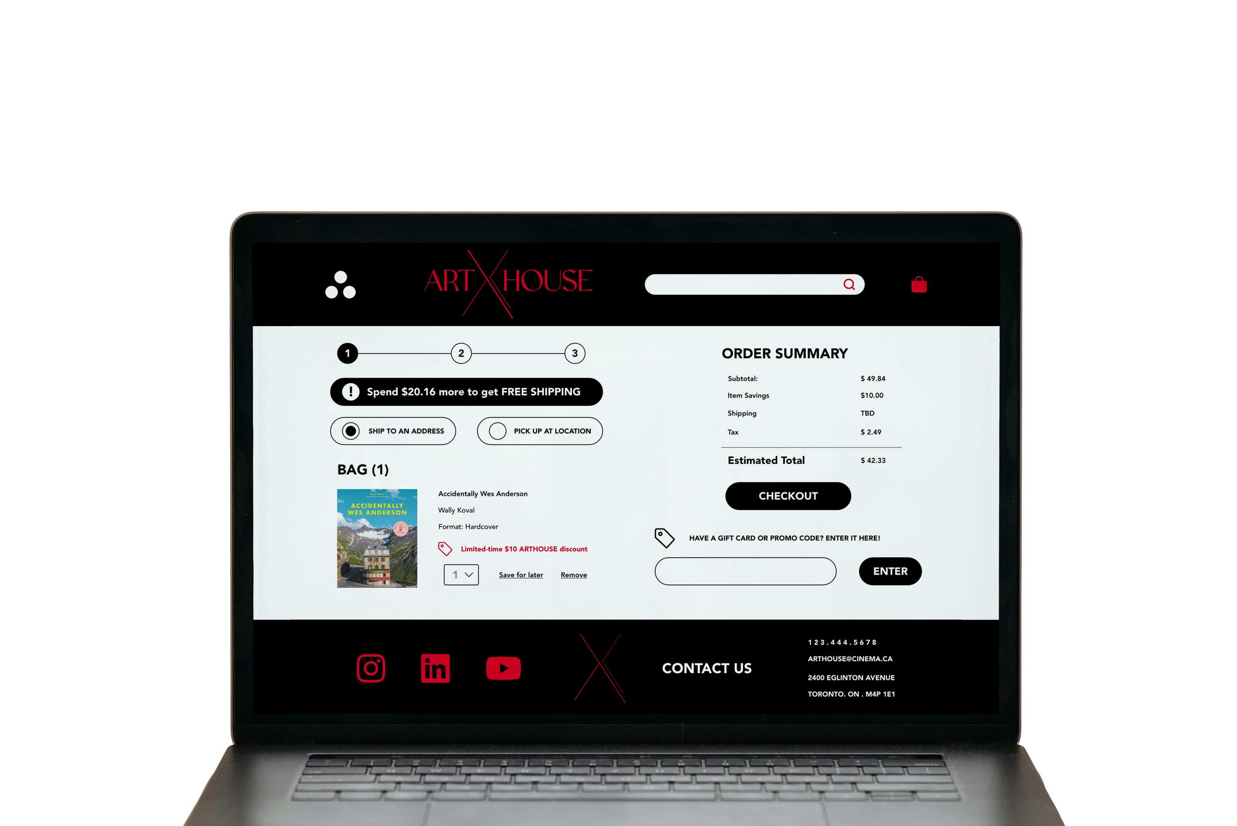
UX / UI Design
Website Design
The Client & Design Direction.
Arthouse is a fictional Toronto-based, independent theatre specialised in the screening of independent films. It offers it patrons with comfortable seating, state-of-the-arts audio, large screens and a gourmet snack menu.
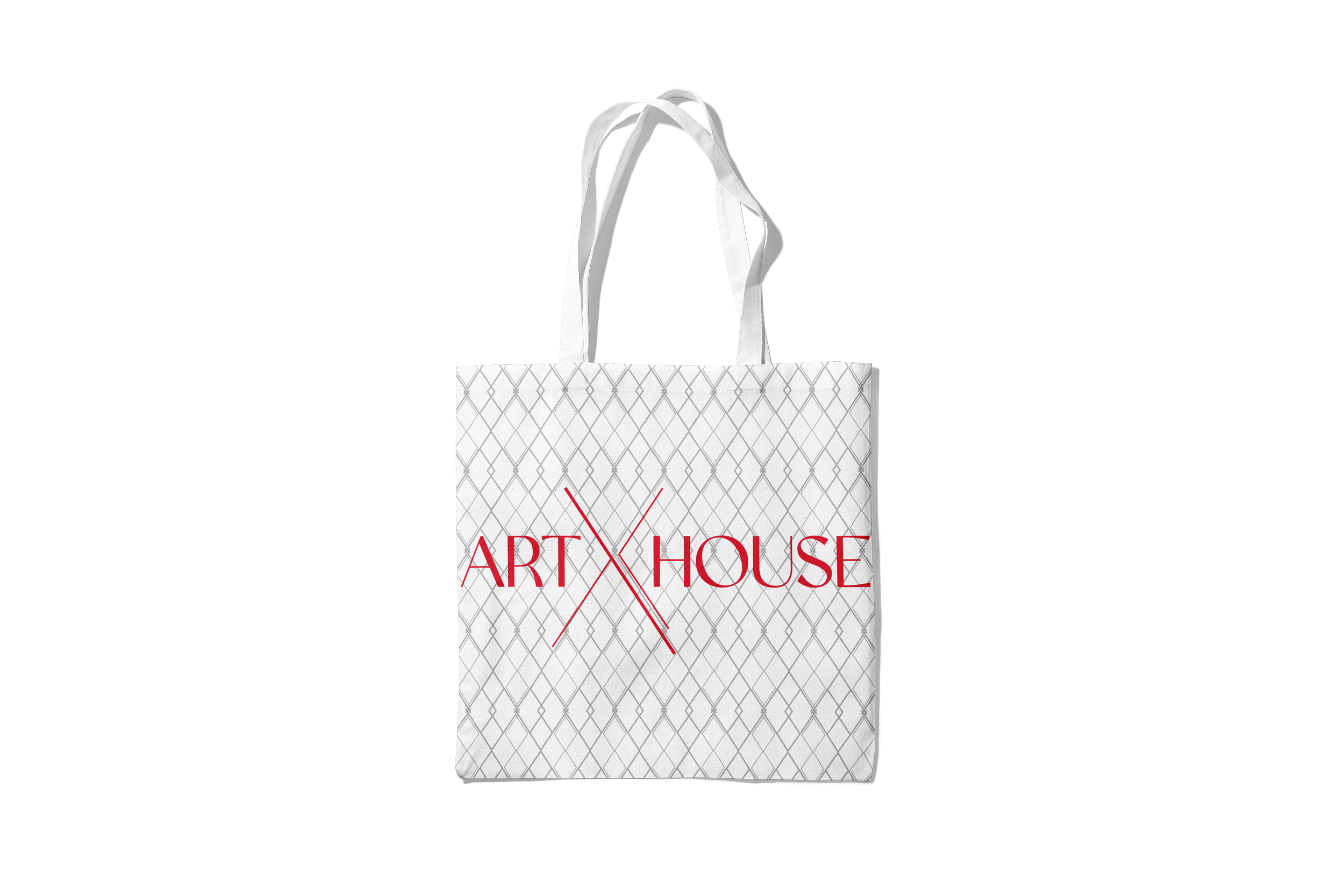
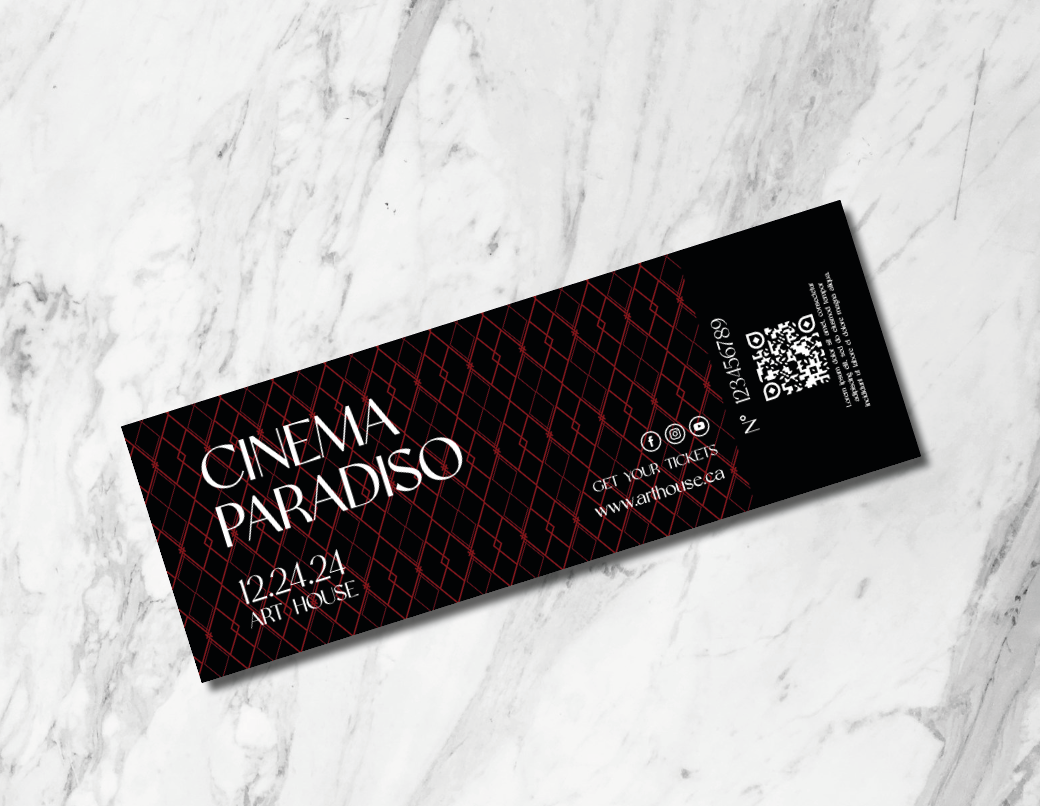
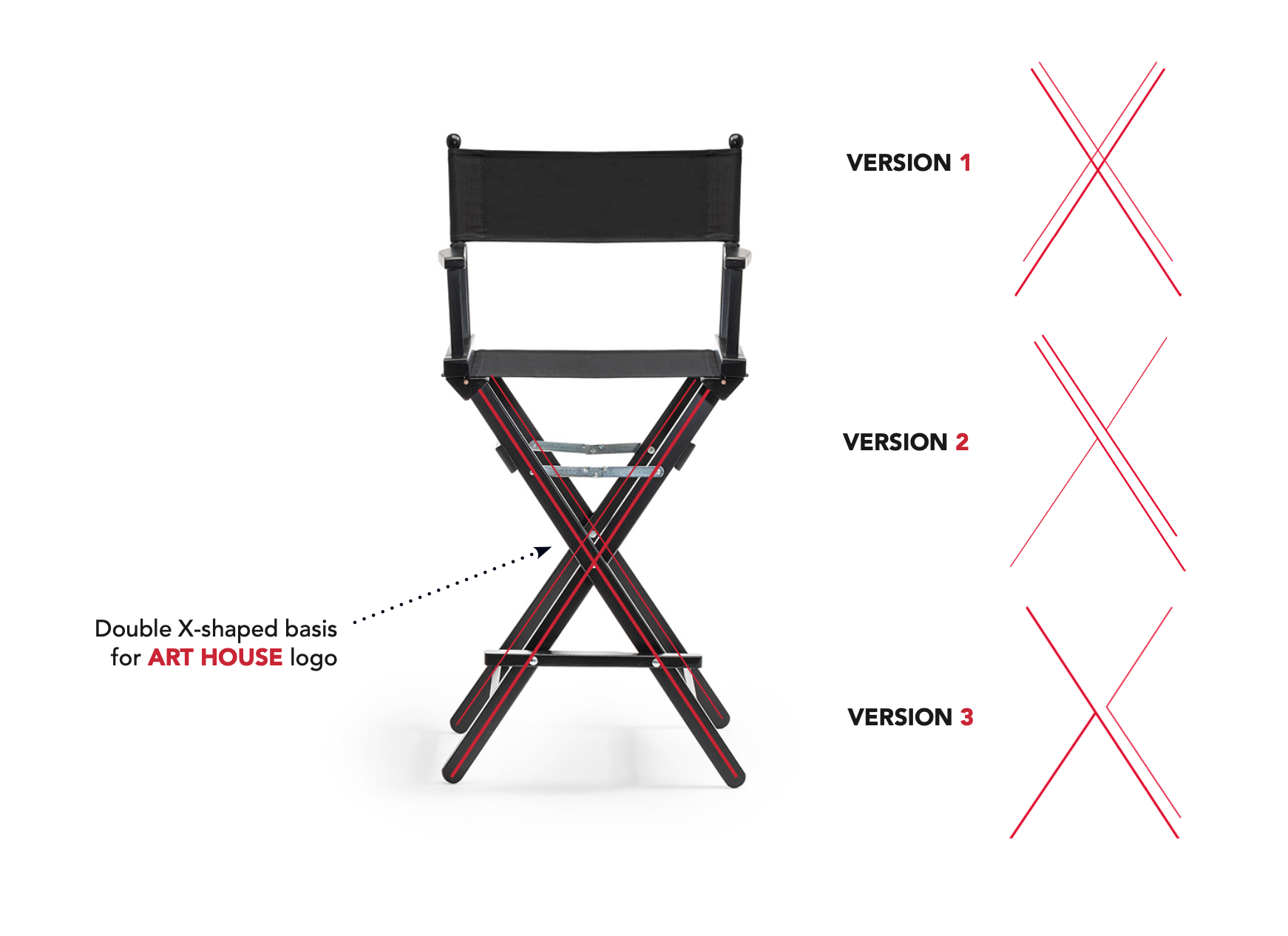
The design direction for Art House illustrates the brand’s sophistication and modernity using geometric elements inspired by the Art Deco movement. The logo pattern forms diamond shapes which, in the Western world, symbolise perfection and immortality. These notions align with the independent theatre’s focus on providing a superior service quality.
The crossing lines represent the foundation of the iconic Director’s chair and the exchange of perspectives which the artsy theatre strives to promote through its ambiance and film selection. These also refer to the light rays which emanate from film projects and convey the theatre’s modernity and edge.